Tang is a fictional company created as part of my coursework for UI/UX 2. I was assigned with creating the UI app or interface that I might use in my day-to-day life. To begin, I considered the interfaces I'd engaged with recently, and an ordering kiosk came to mind. With this inspiration, I began to research the companies that offered food ordering kiosks.
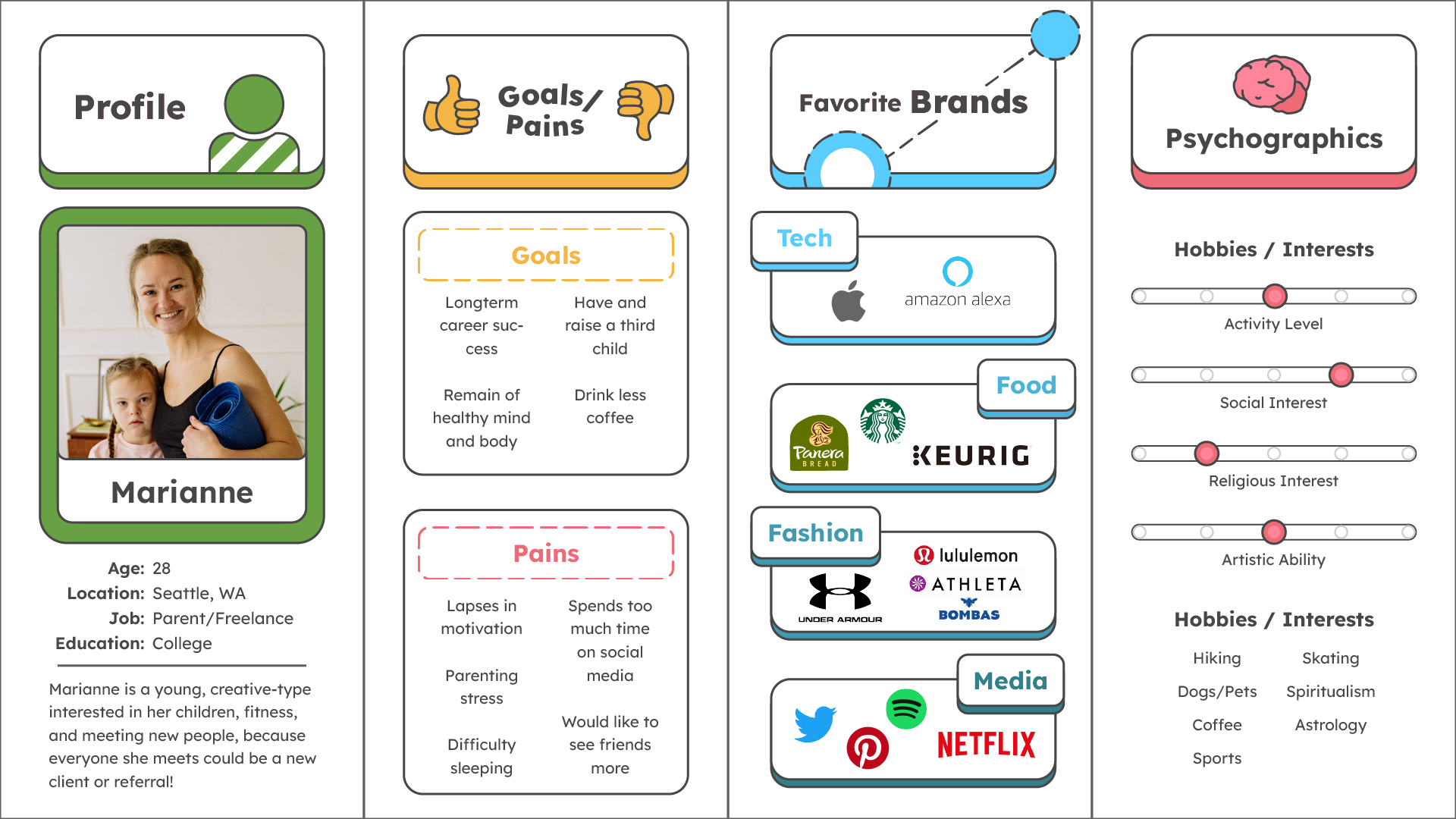
Following this, I began to consider the potential customers that Tang would bring in. I considered similar businesses, such as Starbucks and Dunkin', and began to consider who patronizes those restaurants. I designed multiple customer personas, and considered what each of them might be interested in, how they spend their time, and their goals and pains.
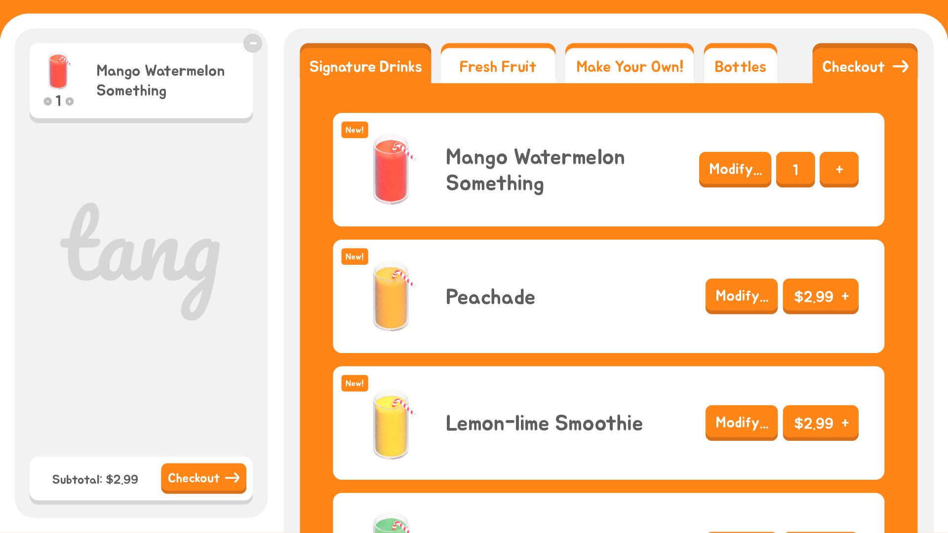
Once I had an idea of the current market and audience for my interface, I could begin designing. I wanted to be sure to use elements and symbols that users were already familiar with– I'm not attempting to reinvent the wheel– I'm intending to make a system that's as intuitive as possible. Here, you can see multiple examples of this– the interface has a tabbed sections like a web browser, and a cart section for items the user has already selected. Symbols are clear and consistent. 'Plus' and 'Minus' icons are used for adding and removing items. Arrows pointing right indicate moving to the next step in the transaction.

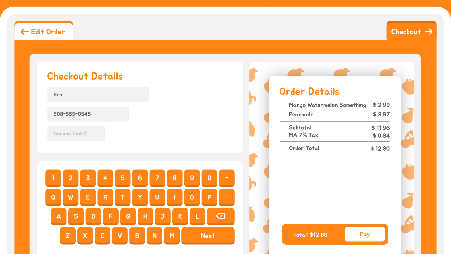
Here, we can see how color act as a useful hint in this design. The Order Details section in the first image is gray, because required information on the left has not been filled. Once this section is satisfactorily complete, the section becomes orange, indicating that a user can now interact with it. In High Contrast mode, the Order Details section would darken, indicating interactivity to users with vision limitations such as low-contrast vision and color blindness.
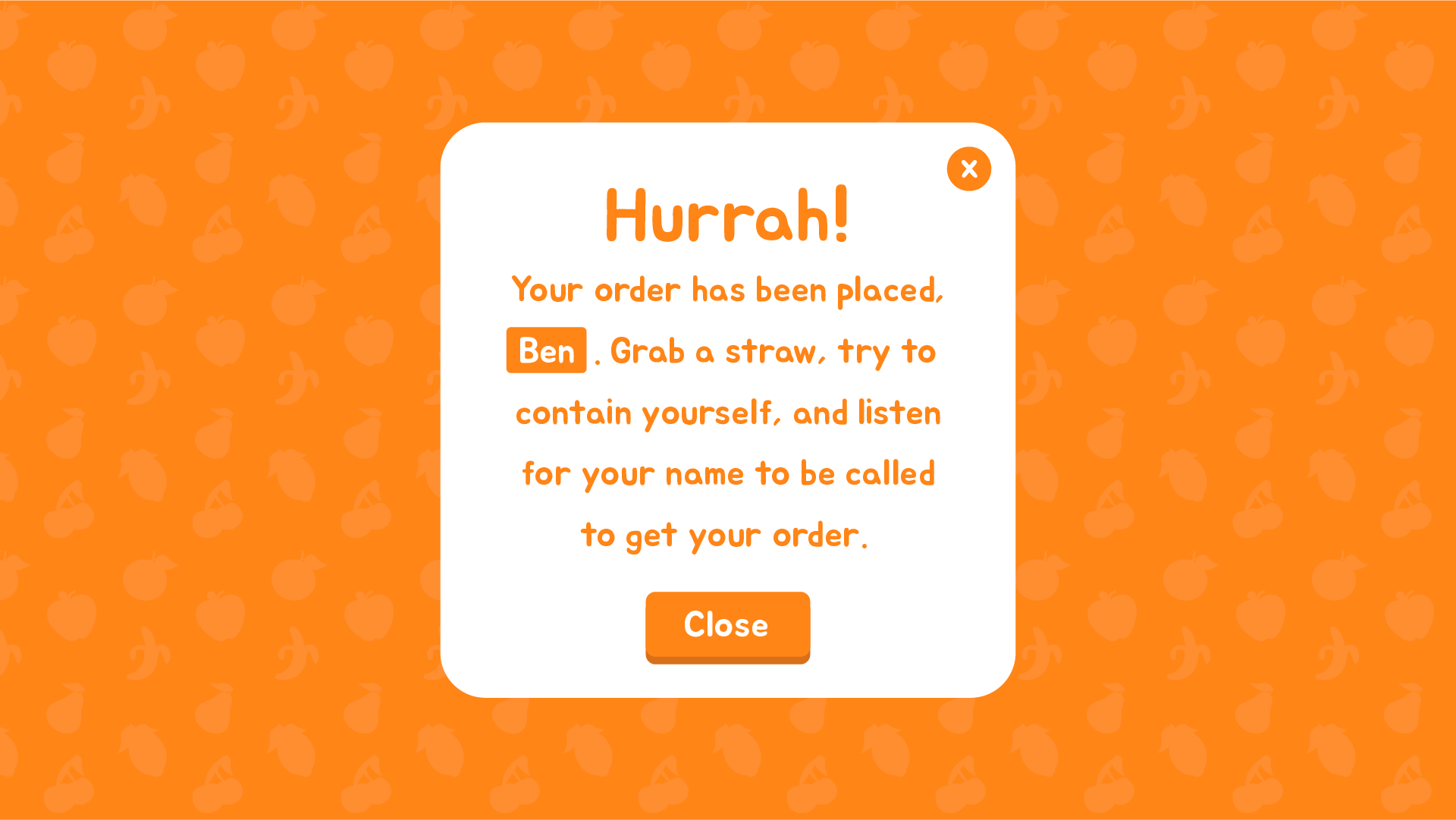
Once an order has been paid for, there is a clear indication that the transaction is complete, with instructions for how the user should proceed. Additionally, the name of the user is displayed to encourage them to pay attention to the instructions for how they should proceed. Without this, a user might just press close and ask a worker where their order is. The window would close automatically, so the next person in line has an easier time beginning their order.

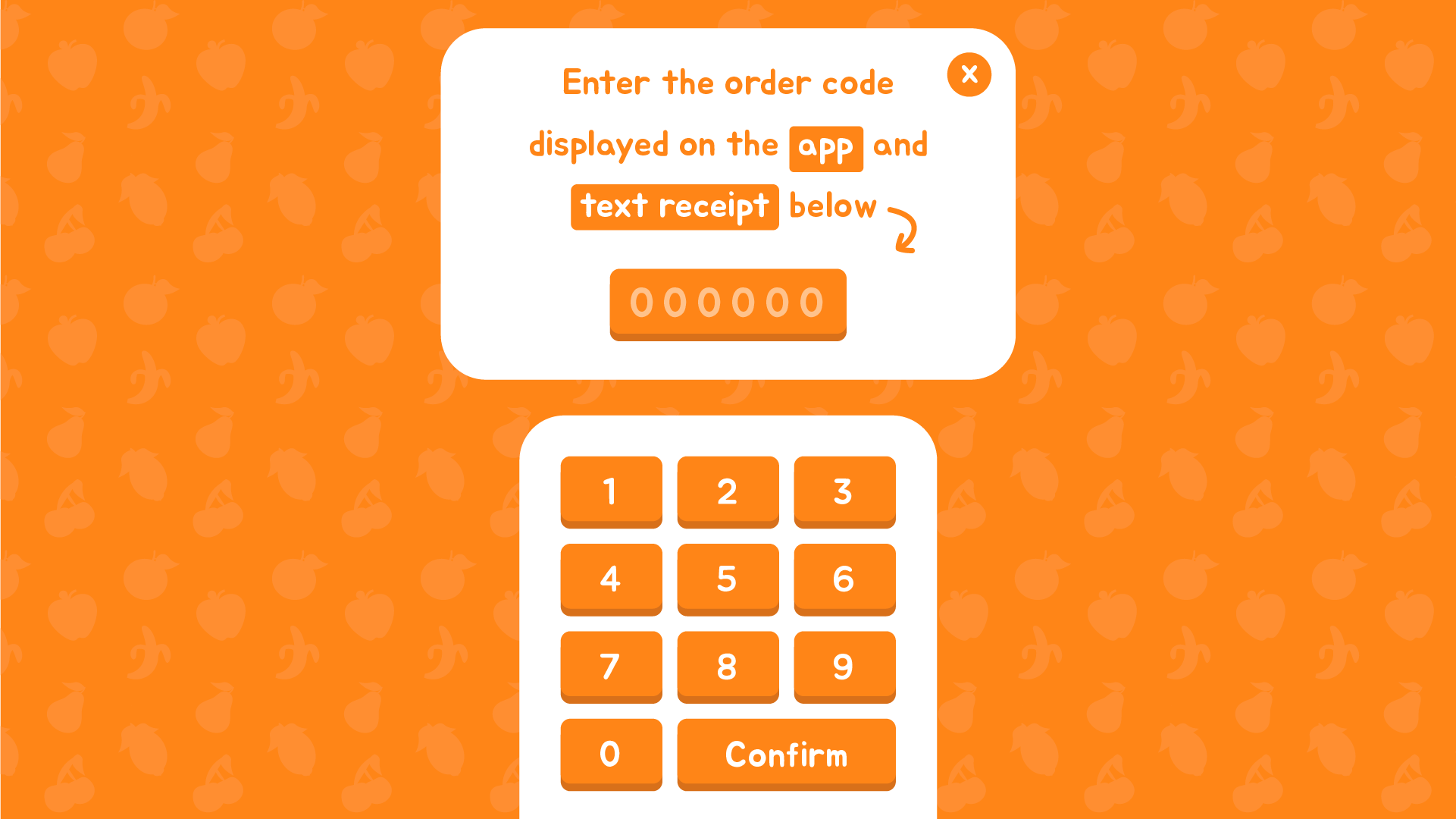
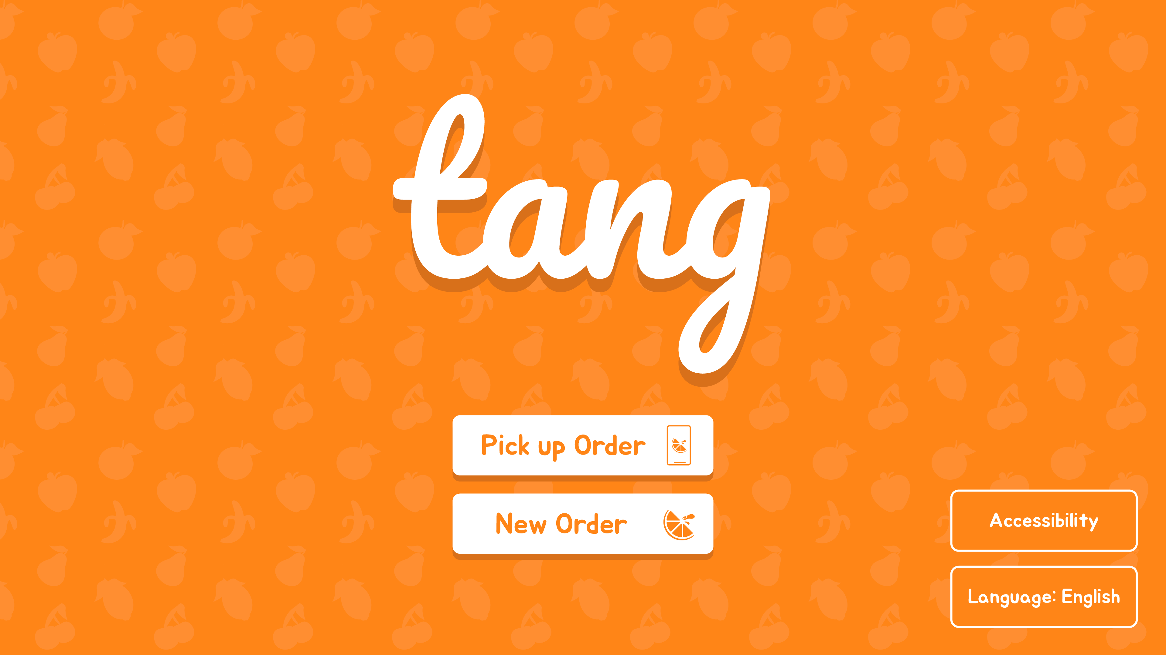
Finally, and perhaps most importantly, we have the default screen of the kiosk. This is what users will see when they approach it. Here, users can pick up an order they placed from an app.
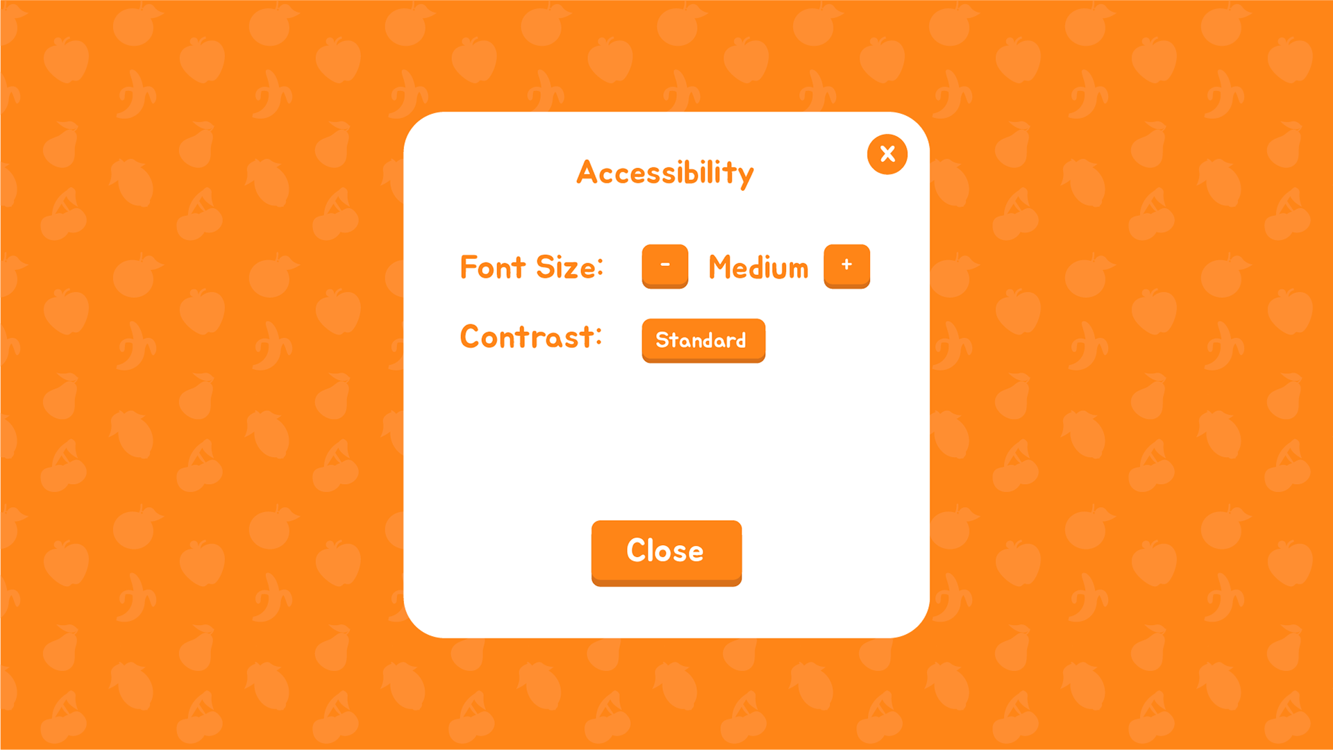
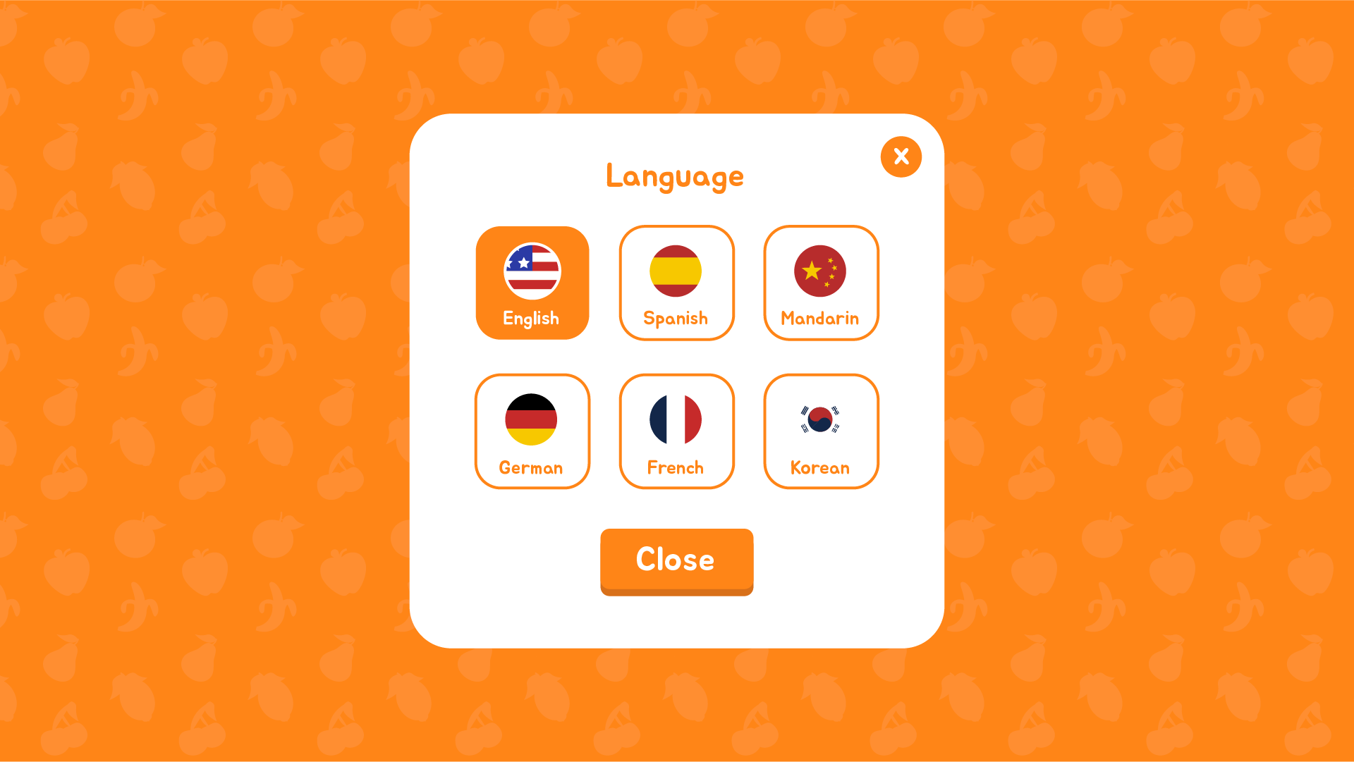
Options for Accessibility and Language are displayed on this default screen– many users do not have perfect vision, and many users do not speak English, so I decided to display them on this default screen, rather than hide them in a menu in the transaction process.