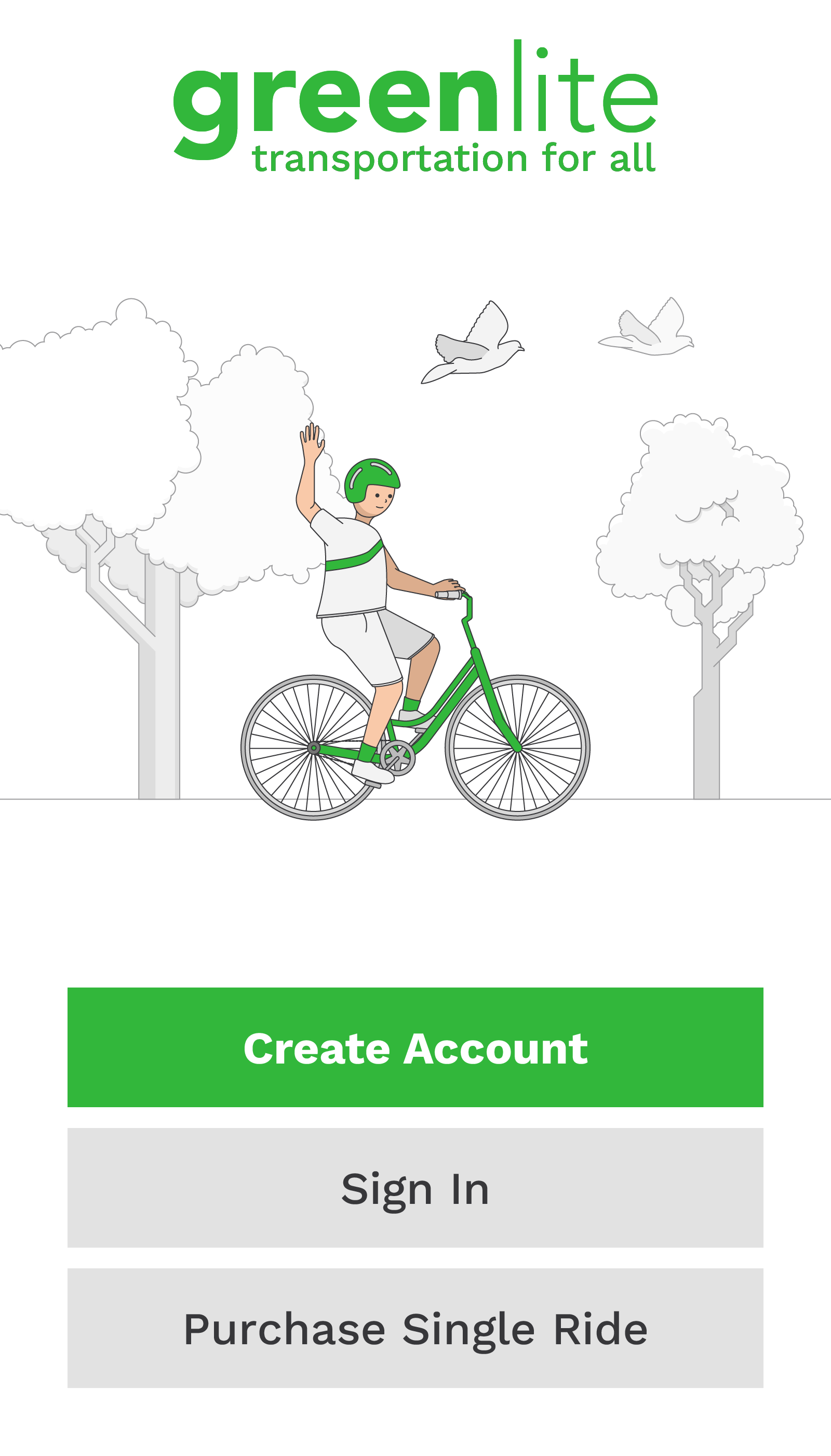
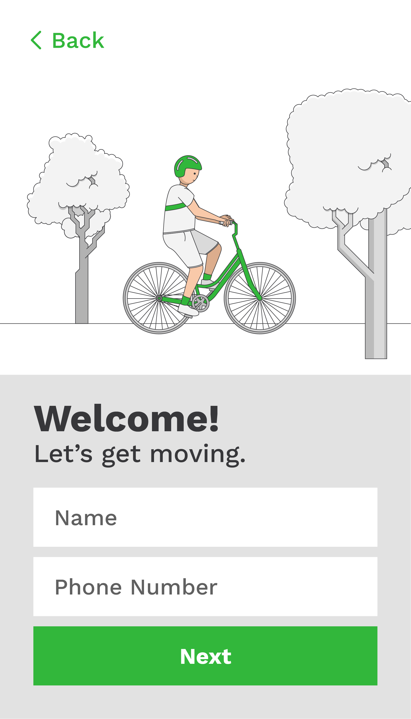
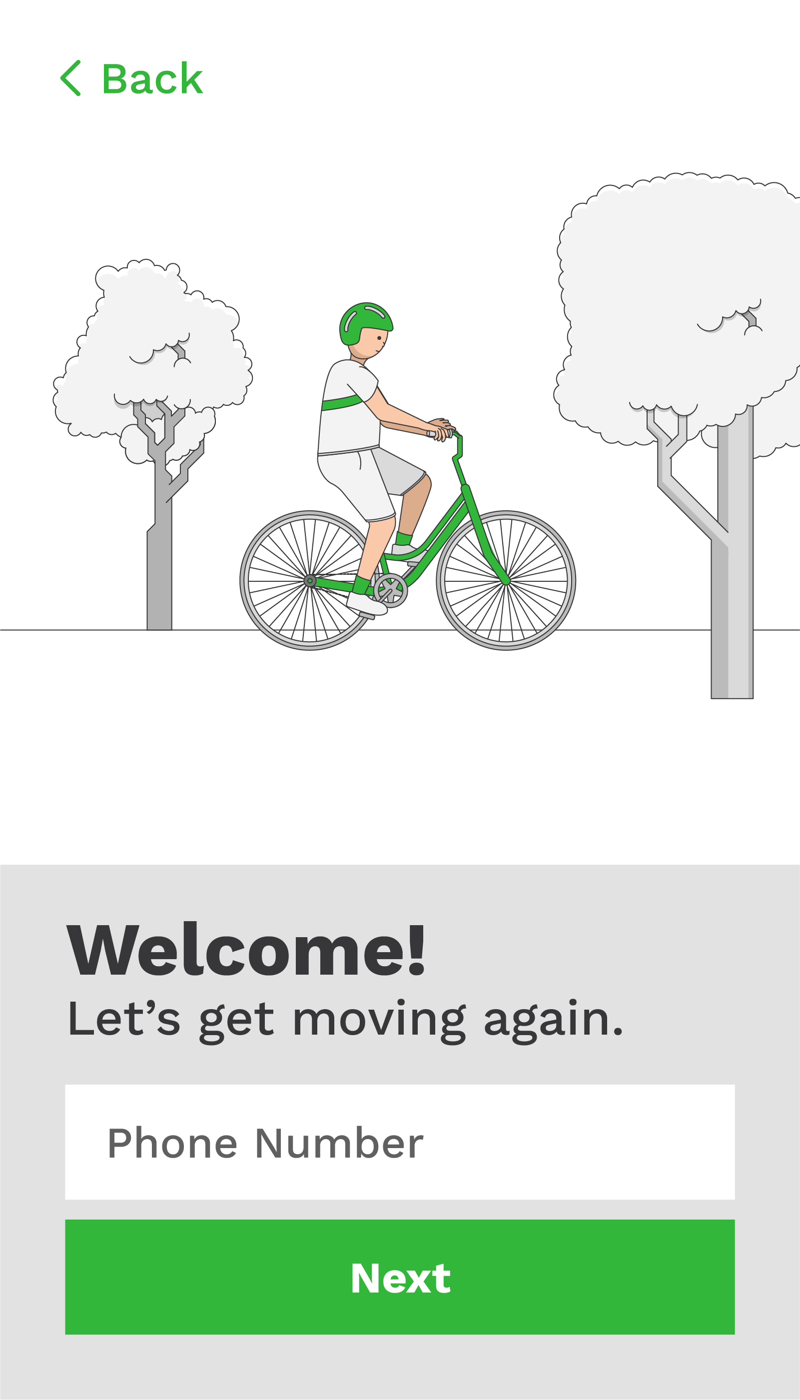
I created greenlite for my UI/UX 2 course at Clark University. I was asked to create the interface for an app that I would like to use, that involved making a purchase. I enjoy bicycling, so I created the interface for a bikeshare service. Above, you can see the main page, and the page you would see after tapping 'create account.'
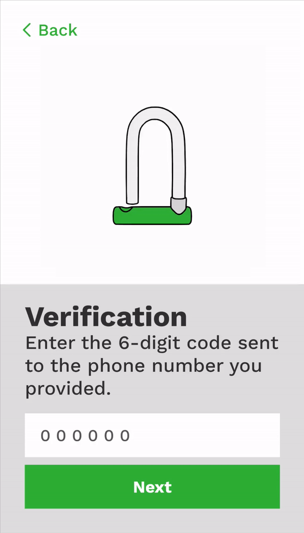
After creating an account, or returning to an existing account, the user is prompted to enter a 6-digit 2FA code. Since the service is created to be accessed via cell phone, it is assumed the user will also have a phone number. This eliminates the need for a password for the service, and allows the user to sign in using this 2FA code and their phone number.
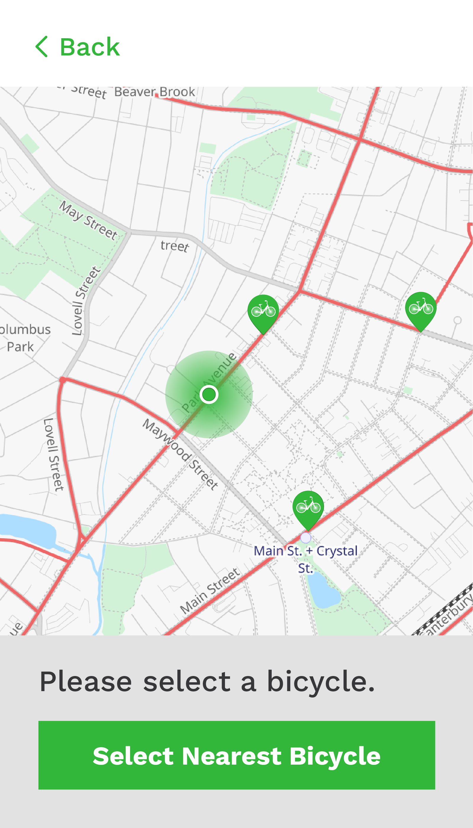
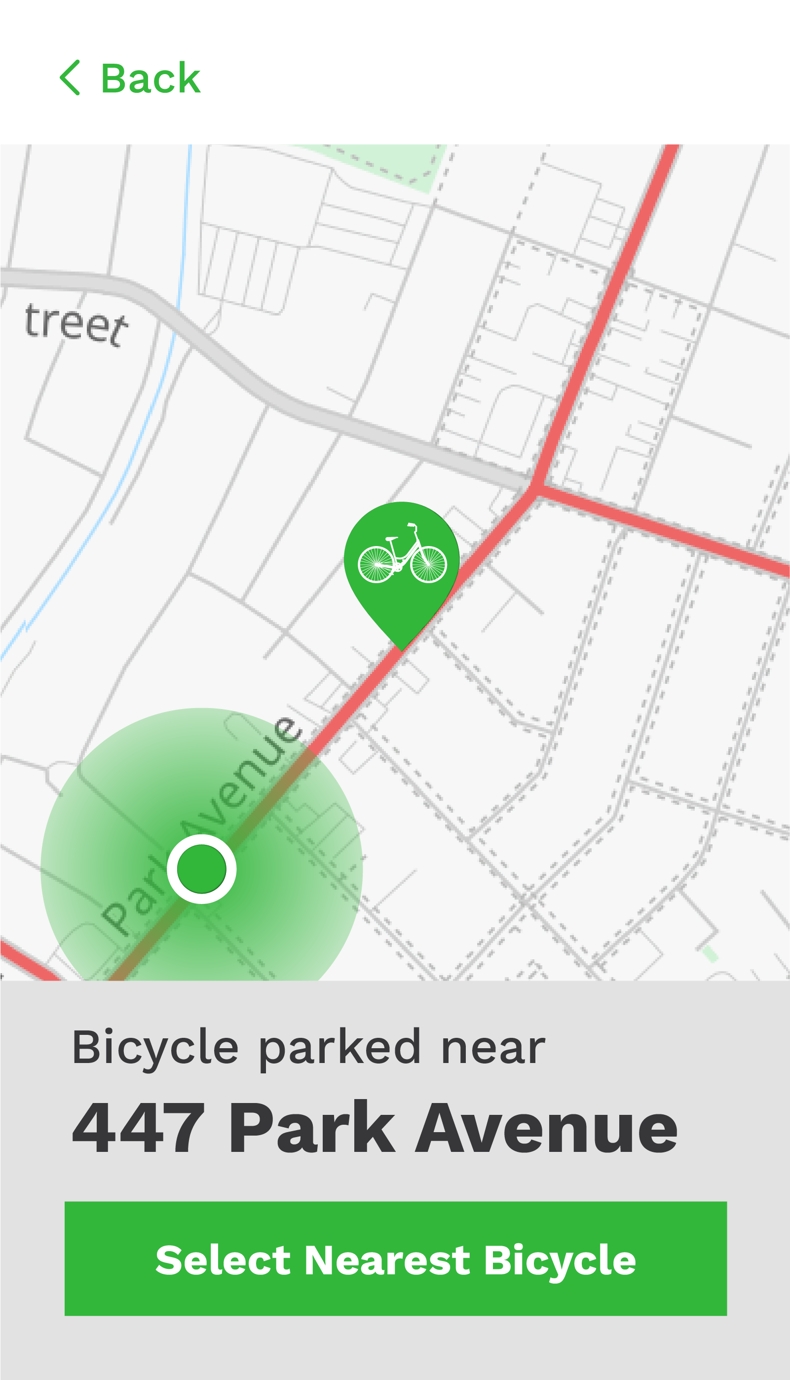
Next, the user is prompted to pick a bicycle. They may select a bicycle from the map, or use the most likely option- picking the nearest available bicycle. This function is easily selected with the large green button.
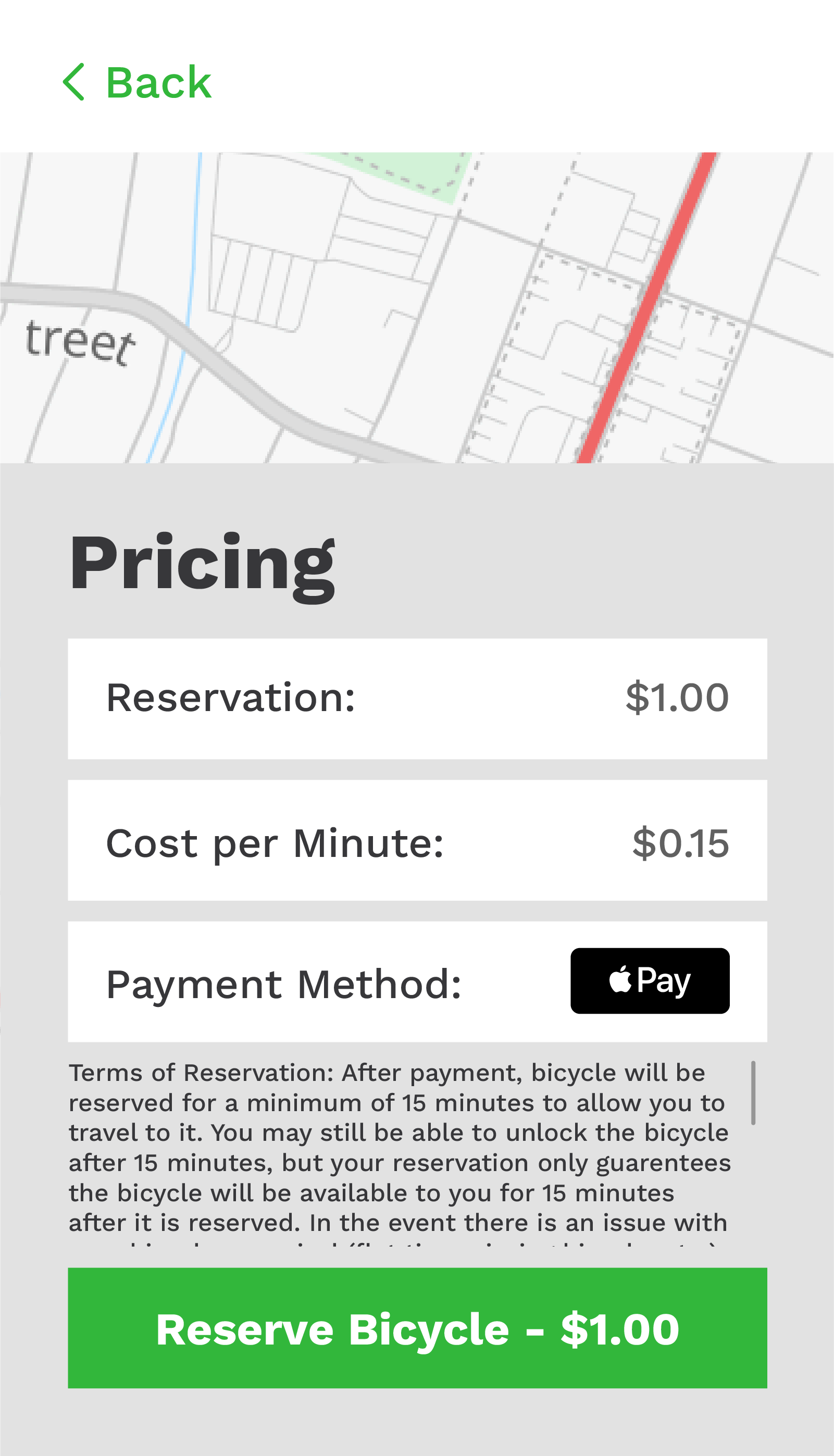
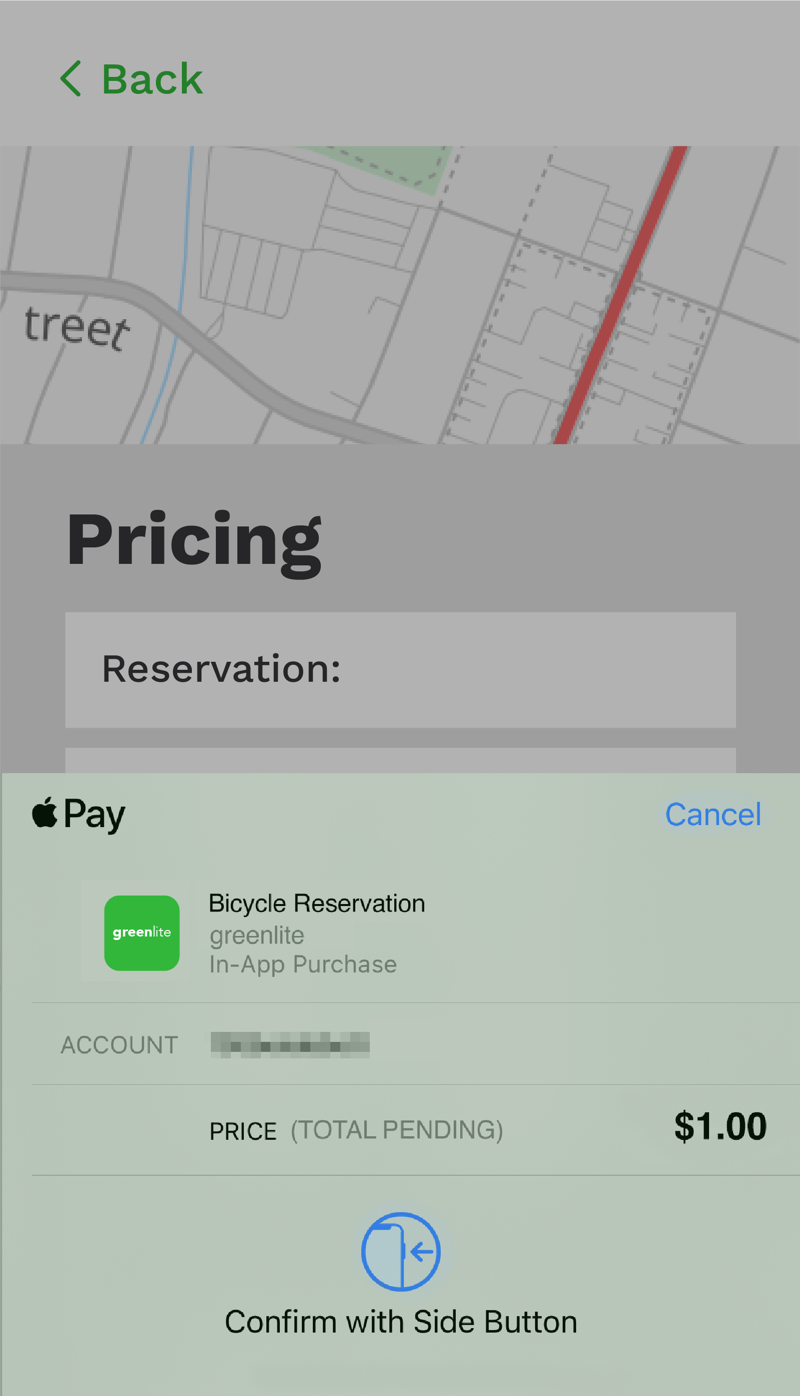
Finally, the confirmation and checkout screens are displayed. The sections containing information are displayed in white, and the bright green button prompts the user to tap it to proceed and finalize the transaction.